With the growing popularity of DNN and the seemingly endless set of modules that have been making their way onto the DNN Store, it comes as somewhat of a surprise that there still aren't very many modules focused on integration with some of the more popular third-party cloud services. Salesforce is one such example. Used by some of the world's biggest companies in various sectors, Salesforce has established itself as the gold standard of cloud-based customer relationship management platforms, as more and more companies rely on it to store their most important customer data.
Syntegrate is hoping that their suite of modules can provide an easy and intuitive way to integrate Salesforce data within a DNN site. Syntegrate Chart is their first module released in the suite, providing a quick yet powerful way to view and manipulate Salesforce objects into visual charts and graphs for placement onto a DNN site.
Let's walk through the process of creating a pie chart in Syntegrate Chart.
Once we've installed the module, we'll start by simply adding a new module to our page.
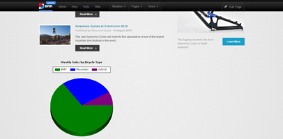
In this example, we want to create a pie chart that compares sales of different bicycle types for our Awesome Cycles website:
Once we've added our module, we need to specify our Salesforce credentials, which we can do in the Settings window:
We can now define our pie chart. To do so, we'll click 'Edit Chart' in the module's Edit menu:
The tool uses an intuitive wizard-type process with four steps, two of which are optional:
Step 1: Start
Here, you can specify the type of chart you'd like to create. Simply select an item from the drop-down list.
To get a sense of what each chart looks like, you can click the 'Example' link to view a sample of the graph you selected:
For our example, we'll select a pie chart, then click 'Next >>' to continue.
Step 2: Pick your data
This page allows you to define what Salesforce data your chart will be reporting on.
Your first step is to select which Salesforce object you'd like to base your chart on. The drop-down list features all of the standard and custom Salesforce objects available to the specified user.
Once you've selected a Salesforce object, you can optionally click 'Show Related Fields' to have the field drop-down lists populated not only with fields directly associated with the object you've selected, but the fields from objects that are related to your selected object as well.
From here, you can select the fields representing your slice label and value (for pie or doughnut charts) or x and y axes (for other charts). For non-pie or doughnut charts, you can specify more than one field to be represented in the y-axis by holding the Ctrl key and clicking on each field you'd like to use. For pie or doughnut charts, you can select only one slice value field.
Lastly, you can specify how often your chart's data should be refreshed with data from Salesforce, allowing you to define when your data gets updated.
For our example, we've selected Bicycle Types as the source of our chart, and we want to compare the sales for our different bicycle types, so we'll select Bicycle Type Name as our label, and Sales as our value. We're going to keep the update frequency to one week, so we can check back to the page on a weekly basis to see how our sales are doing:
Step 3: Filter your data (Optional)
This page allows you to optionally specify one or more filters to apply to your chart data. With this feature, you can specify a filter on any of the fields associated to your Salesforce object, not just those you selected for your axis values.
To add a filter to your data, simply select the field you'd like to filter on in the first drop-down list, select the operator to use in the second drop-down list, and enter a value in the textbox. Then, click the 'Add Filter' button to add the filter to your project.
To specify the type of relationship your filters should have, you can select either 'AND' or 'OR' using the provided radio buttons. The specified relationship would apply to all of the filters in your list.
At any time, you can click on one of the filters in your list and click the 'Delete Filter' button to remove the filter from your project.
Once you've specified your filters, you can click on 'Preview Data' to view a tabular representation of your chart's source data. You can also click 'Preview Graph' to preview your graph before saving.
For our example, we only want to compare the best-selling bicycle types, so we're going to eliminate the types with less than $50 in sales:
Step 4: Look and feel (Optional)
The Look and Feel page allows you to optionally define specific characteristics of your chart in terms of appearance:
Dimensions: dimensions on the page of your final chart
Title: chart title, text size and position in relation to the chart
Color options: predefined set of color schemes to choose from
Chart options: defines the appearance of the chart itself, including 2D/3D, border appearance and tooltip
Legend options: specifies legend appearance and position
Chart-specific options: defines appearance options specific to the type of chart you selected
We're going to make our chart 3D for some visual impact, and select a bright colour scheme. We'll also hide the value labels for a cleaner look and give our graph a title:
Once we've specified all the desired chart options, we'll click 'Update' to save our changes.
Done! We now have a sales chart on our Awesome Cycles page that will update once a week with fresh data from Salesforce.
At $19.99, Syntegrate Chart is a low-cost, effective module for exposing some great-looking Salesforce-driven charts and graphs to your site visitors. But more than that, Syntegrate Chart gives us a glimpse of some of the possibilities we might see in the world of third-party integrations for DNN. Here's hoping we see more of it in the future.